The YouTube Thumbnail Checklist: 9 Things to Check Before You Publish
I've published plenty of videos that went nowhere, and when I look back, the thumbnail was almost always the reason. Not the topic. Not the title. The thumbnail. It's the first thing anyone reacts to, and they react in about half a second, so if it doesn't work at a tiny size on a phone, the video is basically invisible before the title even gets read.
The good news is that weak thumbnails tend to fail in the same few ways. Here's what I run through before I hit publish, roughly in the order that moves the needle most.
Start with the specs
These are boring, and people still get them wrong. Miss them and YouTube either rejects the file or renders it soft, so it's worth thirty seconds up front.
| Spec | What YouTube wants |
|---|---|
| Resolution | 1280 x 720 pixels or larger |
| Aspect ratio | 16:9 |
| File size | Under 2 MB |
| Format | JPG, PNG, or WebP |
Export at 1280 x 720 minimum, in 16:9. Anything smaller looks mushy on TVs and big screens, and a squarer image gets cropped or boxed in the feed. If your source came out small or a little soft, run it through an upscaler before you do anything else. And if the file tips over 2 MB, compress it down; you honestly won't see the difference, but YouTube will let you upload it.
It has to be bright
Dark thumbnails vanish. Most people browse YouTube in dark mode now, so a moody, low-light image just melts into the black background and gets scrolled straight past.
Push the overall brightness into the 40 to 75 percent zone. That range reads well whether the viewer is in light mode or dark mode. If yours sits below that, lift the exposure or put a lighter background behind whatever your subject is.
Contrast is what makes it pop
Contrast is the thing that peels your subject off the background so the eye locks on. Low-contrast images turn to mush at small sizes, which is where every thumbnail actually gets seen.
You want real separation between subject and background. A rim light works. So does a thick outline, a drop shadow, or just picking a background tone that isn't the same as your subject. When the two are fighting each other, the fastest fix is to cut the background out entirely and drop your subject onto a clean, contrasting color.
Three or four words, that's it
Nobody reads a sentence off a thumbnail. There isn't time, and there isn't room. The title carries the detail, so your thumbnail text is a hook, not a summary.
Keep it to three or four words, big and bold, ideally with a heavy outline so it survives whatever's behind it. Cut the filler while you're at it. "I Made $10,000" beats "This Is How I Managed To Make $10,000 Last Month," and it's not close.
Can you read it thumbnail-sized?
This is the one almost everyone skips. Your text looks great on a 27-inch editing monitor. Then the video shows up 168 pixels wide in the suggested column next to whatever people are actually watching, and half your words turn into a smudge.
Shrink your thumbnail on screen until it's about phone-thumbnail size and try to read every word. If you can't, the words are too small or there are too many of them. Bump them up or drop the weakest ones.
Faces still win
In most niches, a big expressive face beats no face. It gives the viewer a person to connect with and an emotion to read before they've processed anything else. Surprise, joy, disgust, whatever fits, as long as it's clear.
Aim for the largest face to fill somewhere around 15 to 30 percent of the frame. A tiny face lost in a wide shot does nothing for you. Crop in tight so the expression actually lands. (Gaming, screen recordings, and a lot of product content are the usual exceptions, so use your judgment.)
Watch the bottom-right corner
YouTube slaps the duration badge over the bottom-right of every thumbnail, and it draws a red progress bar along the very bottom for anything a viewer has partly watched. Put something important there, a word, a face, the product, and it gets covered up in the feed.
So keep that corner and the bottom edge clear of anything the viewer needs to see. Design around it from the start instead of noticing it after export.
One subject, not a collage
A busy thumbnail with five things competing for attention makes the eye work, and a working eye keeps scrolling. Pick one subject and commit to it.
Strip out the background clutter, the extra props, anything that isn't earning the click. Color helps here too. A saturated, punchy subject against a calmer background pulls the eye, whereas a flat single-hue image just sits there. If your palette is all one color family, throw in one accent that fights it.
Actually test it
You cannot judge your own thumbnail full-size on a big screen. You have to see it the way viewers do, which is small, in a real feed, boxed in by competitors, usually in the dark. That's exactly where thumbnails that looked fine in your editor fall apart.
Going through all nine of these by eye every time is a pain, so the last thing I do is run it through a tool that checks them for me.
Score your thumbnail in seconds
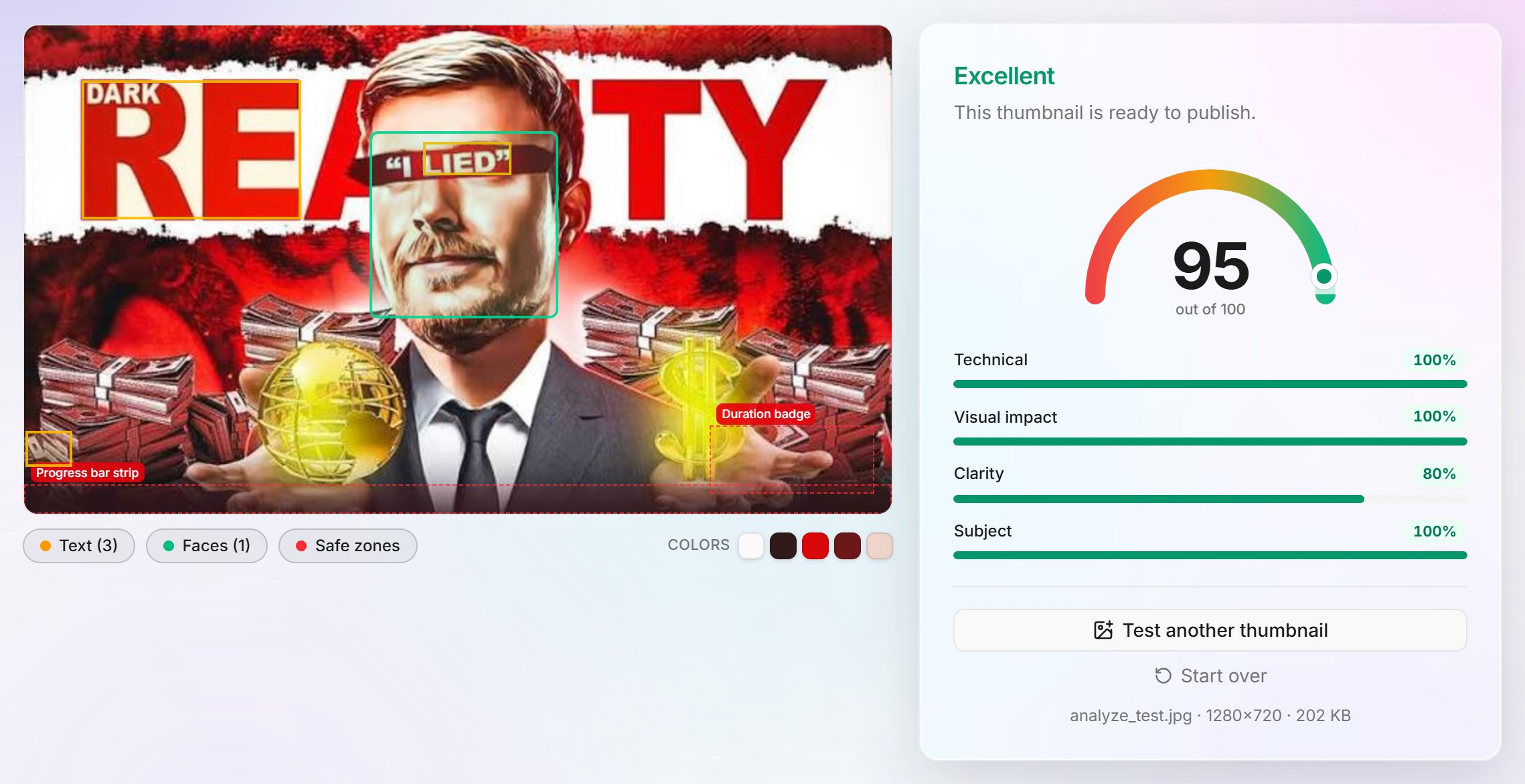
The free YouTube Thumbnail Analyzer grades your thumbnail against everything on this list. Drop your image in and you get a 0 to 100 score plus the specifics behind it:
- Resolution, aspect ratio, and file size, checked against YouTube's limits
- Brightness, contrast, saturation, and sharpness, measured
- Word count and a read-at-small-size estimate
- Face detection with the face-to-frame ratio
- A warning if anything sits under the duration badge
- Side-by-side previews of the home feed, suggested column, mobile app, and search, in both light and dark mode
It all runs in your browser, so the image never gets uploaded anywhere. Tweak something, drop it back in, and watch the number move.
Test your thumbnail free with the YouTube Thumbnail Analyzer